 LAPEL The Style LAPEL The Style
 Within the smart casual palette, optimal pairings of blazers and Oxford shirts are built on three axes: contrast in lightness, temperature balance, and a neutral base.
Saturated or dark shirts (navy, graphite) require either a lighter blazer or a pronounced textural difference to keep the visual layers from collapsing into one another.
Each pairing below is tagged with Contrast — the lightness distance between blazer and shirt — and Formality — where the pair sits inside the smart casual band (Low / Medium / High).
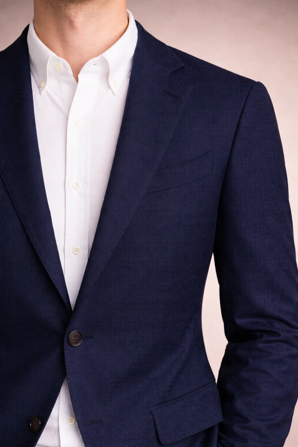
Maximum contrast, classic clarity.
The default blueprint. Off-white softens the jump pure white shows against a structured navy blazer — useful when tailoring is sharp.
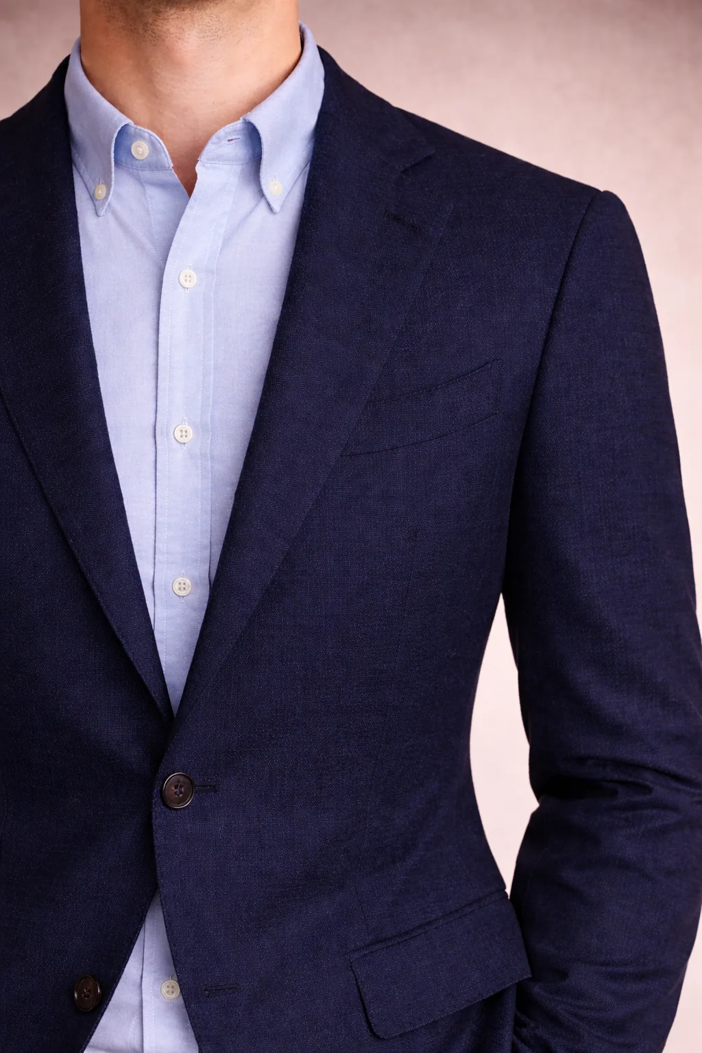
Soft contrast, the most versatile pairing.
Probably the single most useful pair in the system. Light blue reads as an extension of navy, so the outfit feels unified rather than layered. Lowest failure rate if fit is imperfect.
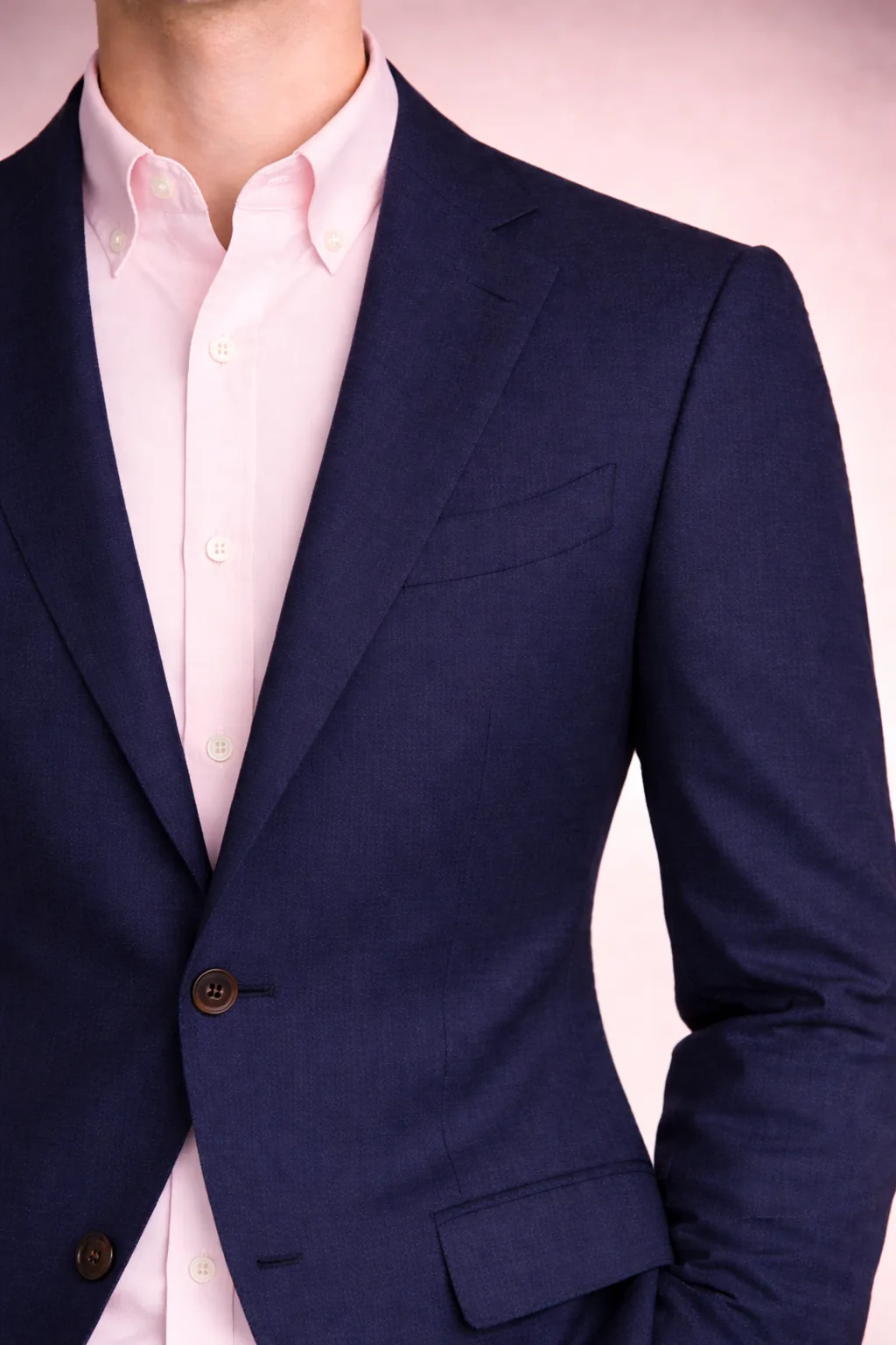
A classical preppy counterpoint to navy's severity.
Pale pink warms navy without softening its structure — a staple Ivy pairing for spring and summer. Opens up a wider range of trouser options (grey, beige, cream) than light blue does.
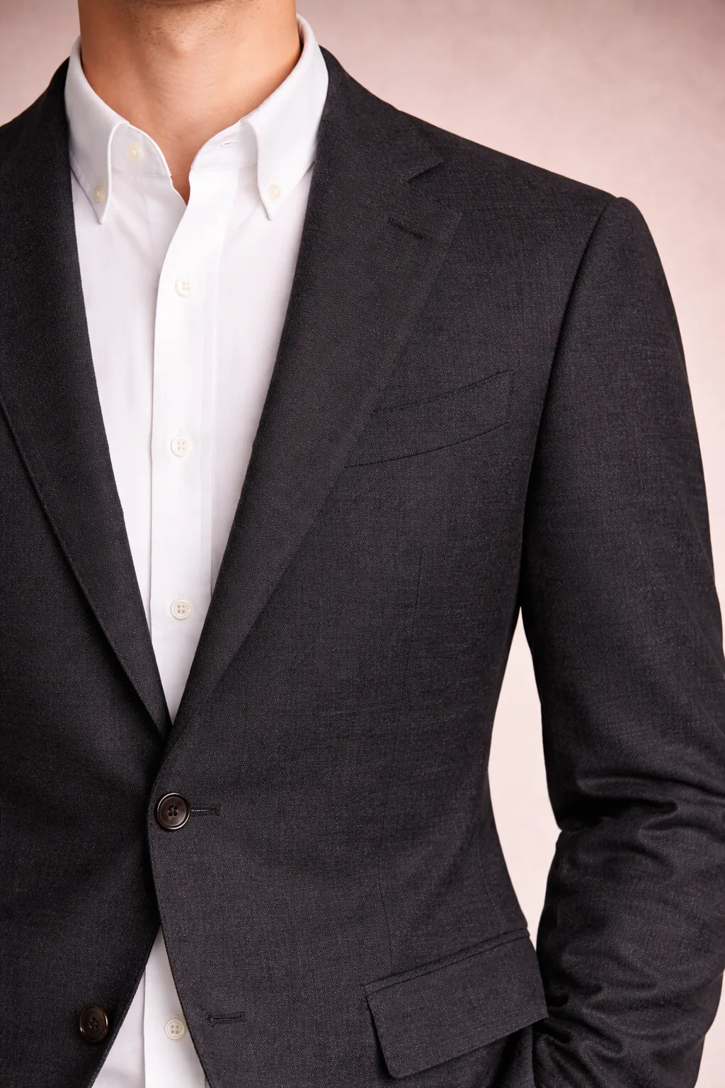
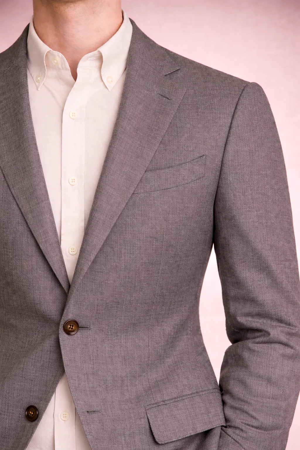
Strict neutral balance without overload.
Leans toward business casual — charcoal pulls formal. Anchor it casual with stone or olive chinos and loafers, or it reads as a suit set.
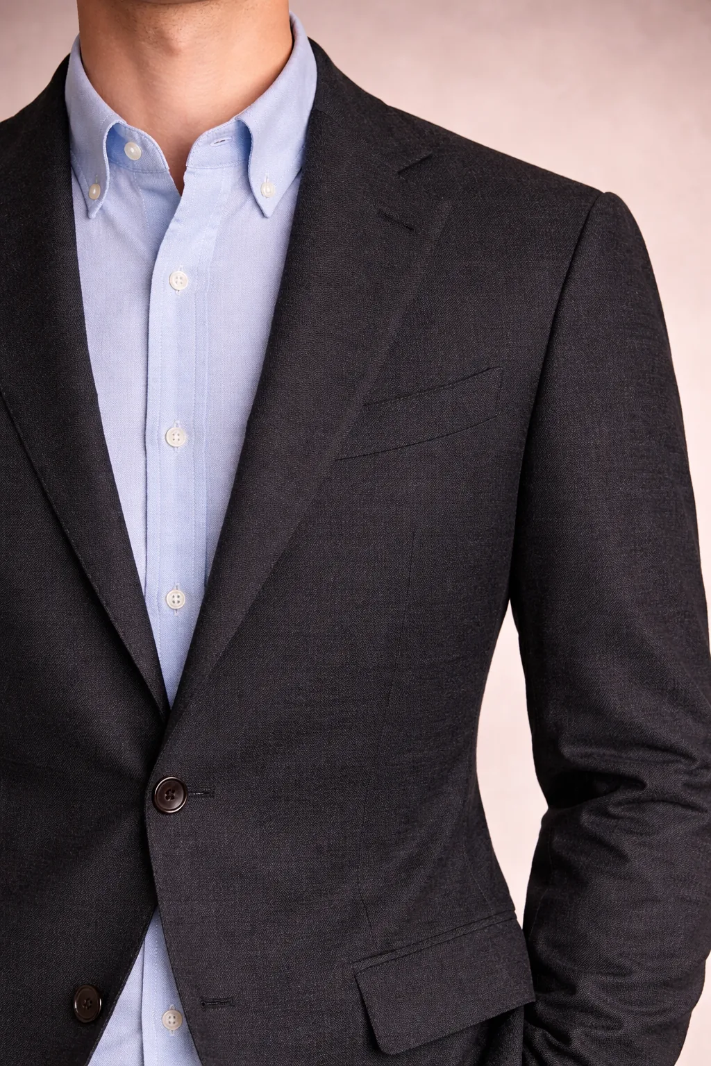
Reduced formality while retaining structure.
The workable casual version of a charcoal-suit look. Cool blue echoes charcoal's blue undertone, so the pair relates rather than contrasts.
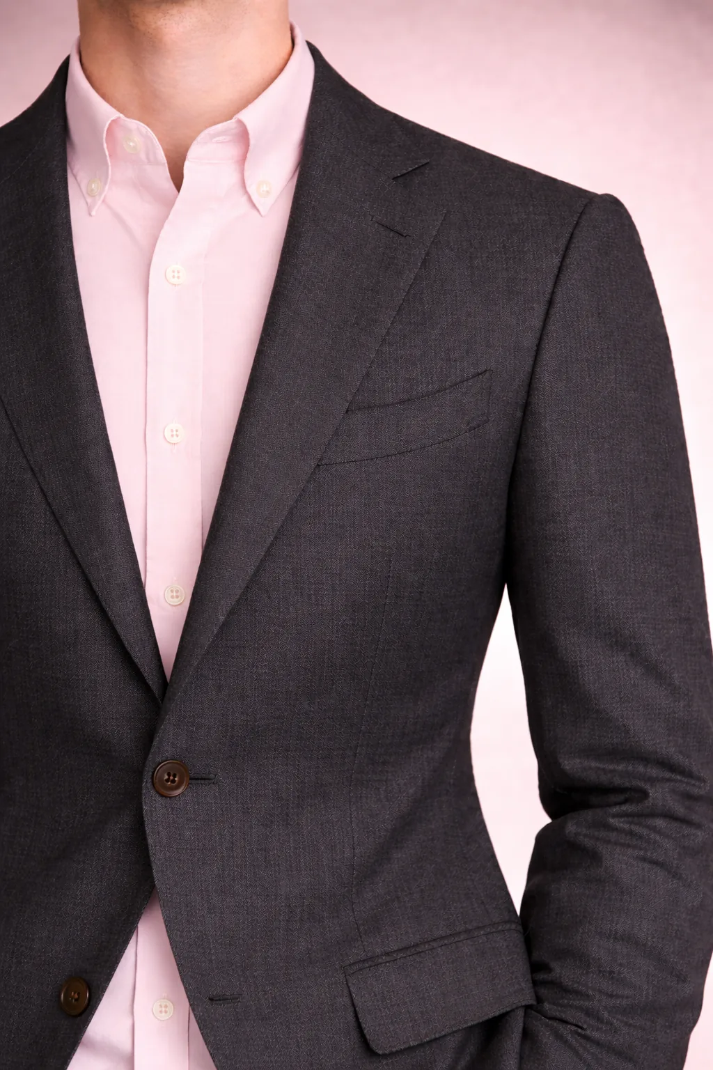
Warm accent on a cool dark base.
A well-established business-casual bridge. Pink keeps charcoal from reading severe without softening the formality too far — a useful middle ground between charcoal+white (stiff) and charcoal+light blue (expected).
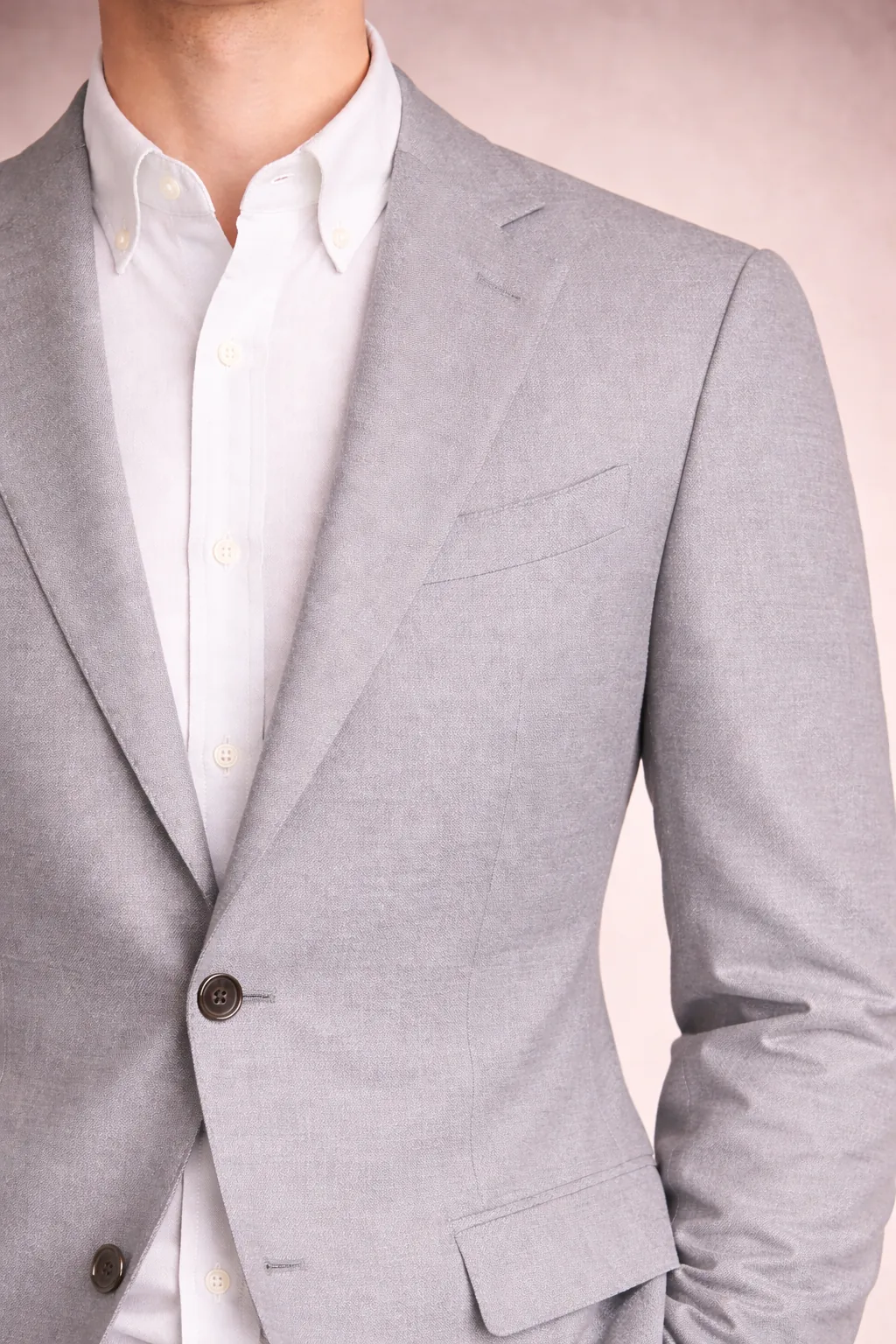
Light monochrome scheme, visual lightness.
Summery and open. Risk is visual flatness — a linen or hopsack blazer, or a textured oxford, restores dimension.
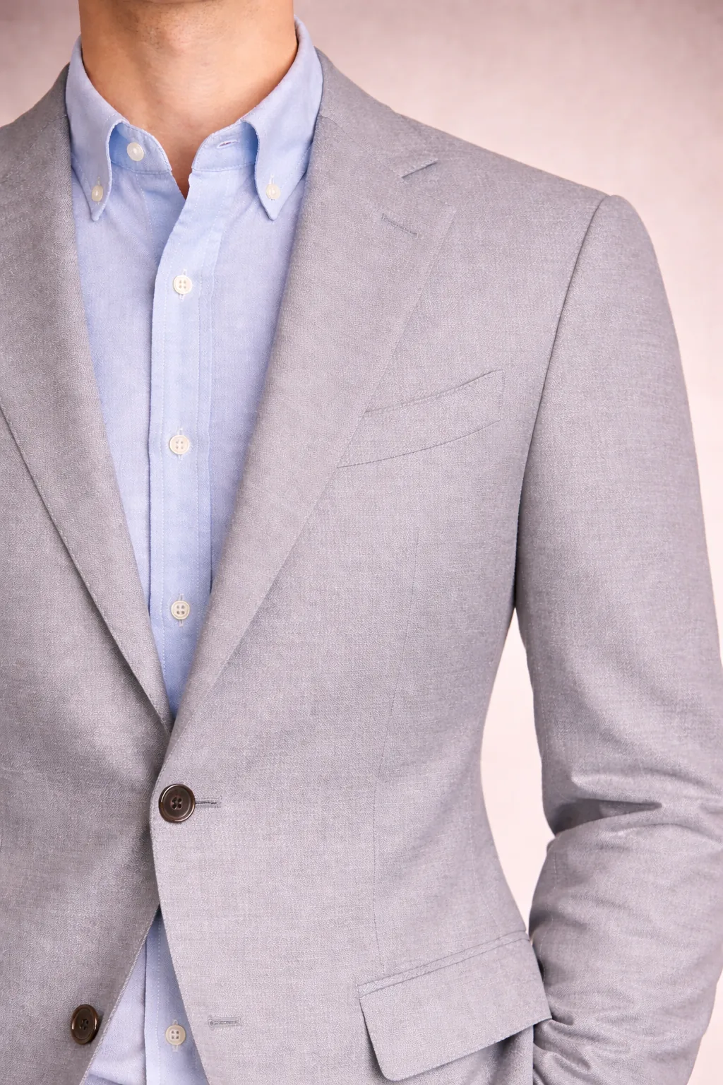
Minimal contrast, quiet smart casual.
Close to the edge of "washed out." Works best when one element has texture or the trousers anchor the base. Good in heat.
A cleaner middle between navy+white and charcoal+white.
Less formal than charcoal, less stark than navy. One of the more common mid-grey defaults — works across more trouser colours (navy, beige, olive) than either of its neighbours.
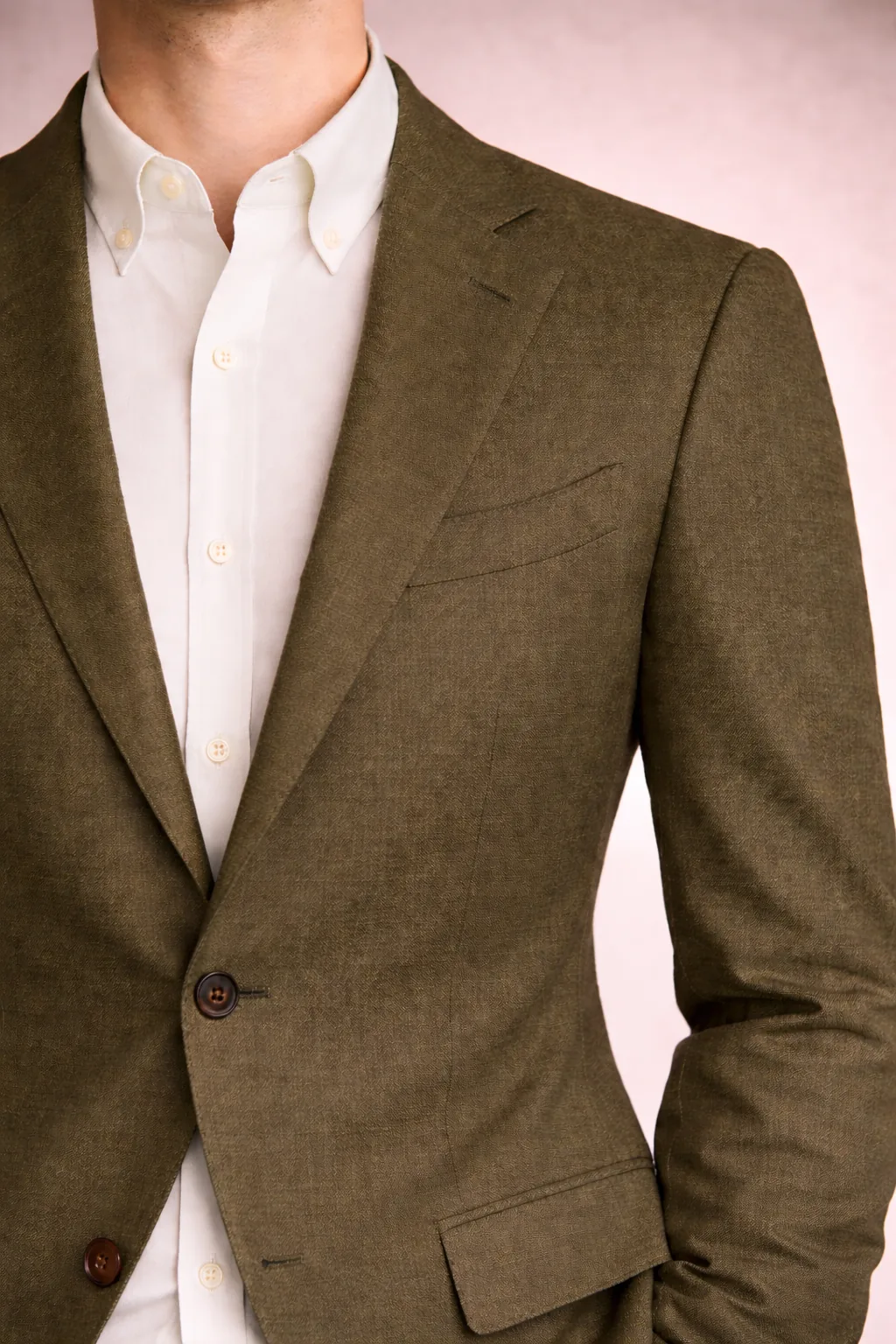
Clean contrast with muted green.
Olive is the least formal jacket here. White keeps it crisp; off-white softens. Works with denim or stone trousers, less well with grey flannel.
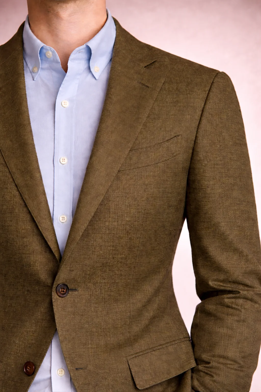
Muted nature-tone pair, low saturation required.
Works *if* both items stay desaturated — muted olive against washed pale blue. Saturated olive + bright blue reads sportswear.
The two pairings below flip the usual lightness hierarchy: the shirt is darker than the blazer. They read as intentional choices rather than defaults, and the rest of the outfit needs to support the move.
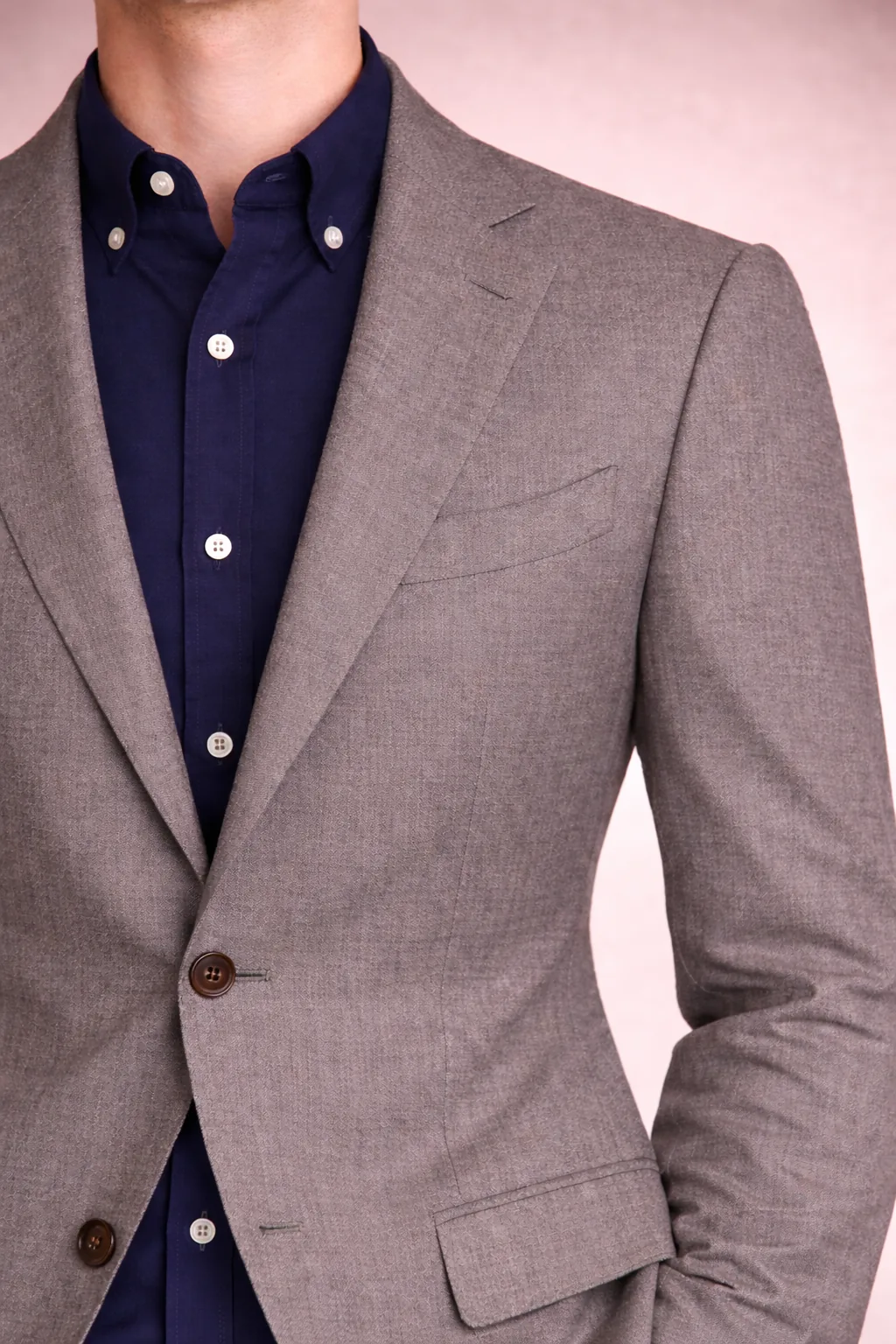
Controlled dark contrast, inverted hierarchy.
Works because grey and navy are both neutral and both cool, so the colour family holds even as the lightness flips. Risk: reads costume-y if the grey is too pale or the navy too saturated.
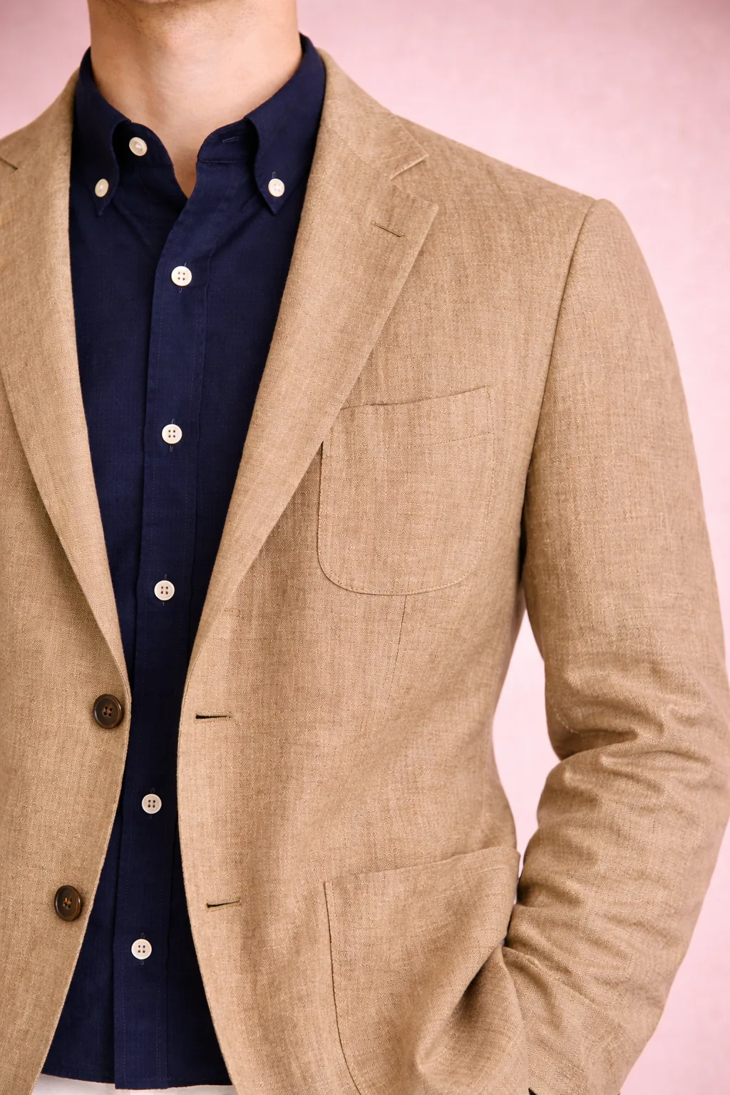
Warm blazer, cool dark shirt — the heritage inversion.
Temperature contrast on top of the lightness inversion. Patch pockets, soft shoulders, and a visibly textured weave (linen / hopsack) make the inversion read as deliberate rather than formal-gone-wrong. Autumnal register; at home with denim, cotton trousers, or suede loafers.
Beige / ecru blazer pairings (with white, light blue, and navy) are part of the system but not yet photographed. They occupy the “warm neutral” slot between camel and off-white, and rely on textural separation — linen, hopsack, or open-weave — to keep tone-on-tone combinations from merging.