Before we trace the history of colour through civilizations, we need to understand pigments — the materials humans have used to create colour in paint, dye, cosmetics, and clothing for tens of thousands of years. A pigment is a substance that absorbs certain wavelengths of light and reflects others. The reflected wavelengths determine the colour we see.
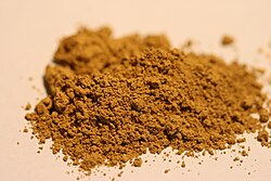
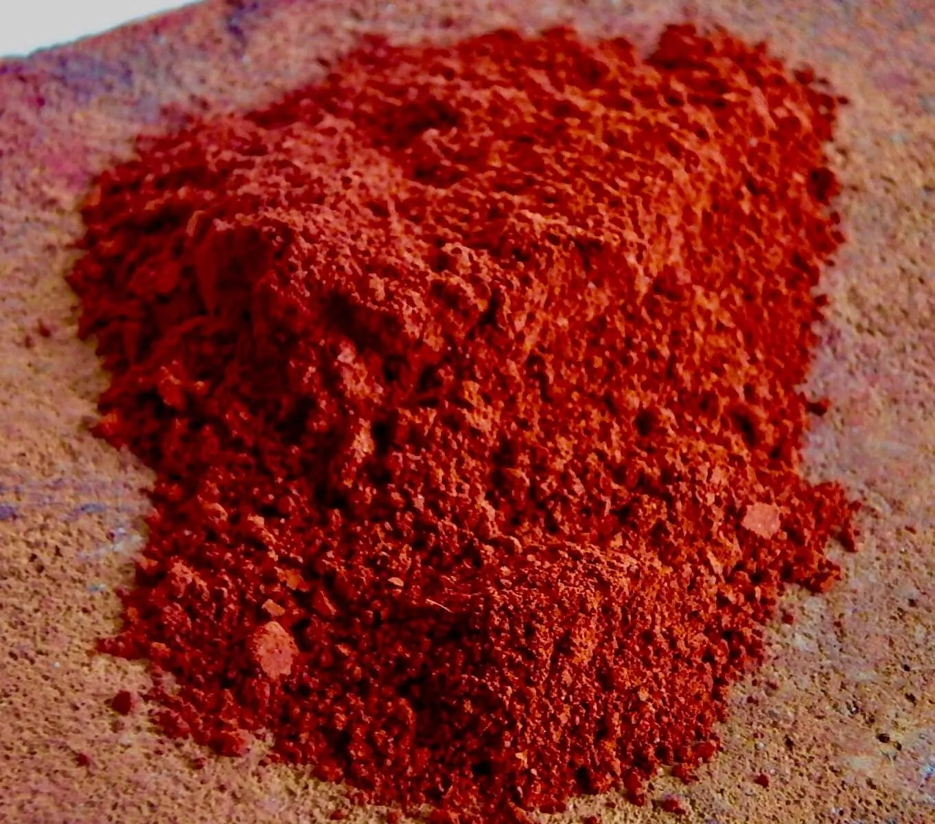
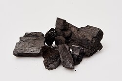
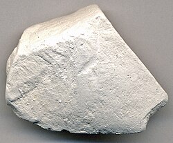
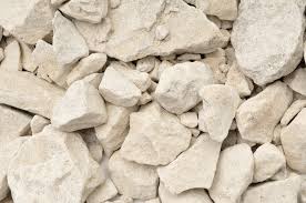
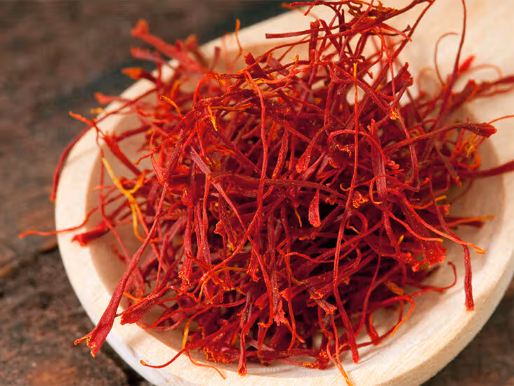
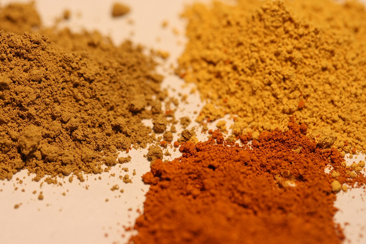
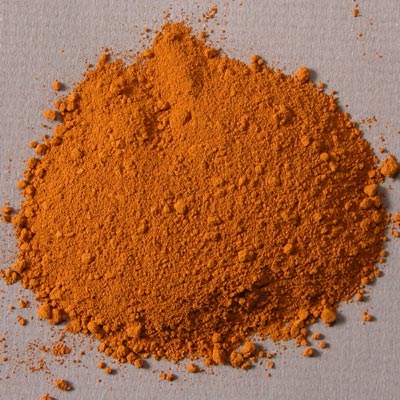
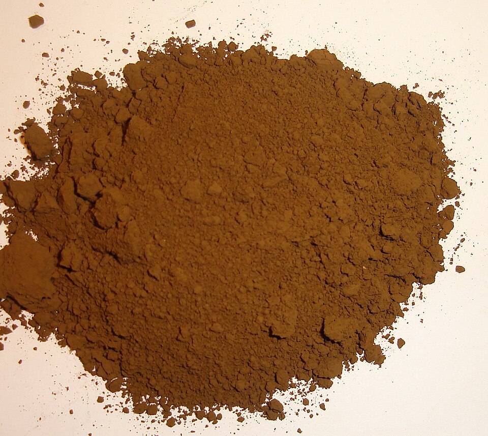
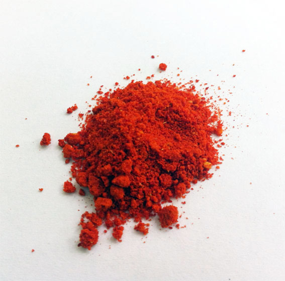
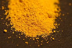
Early pigments came directly from the earth: ochre (iron oxide — yellow, red, and brown), charcoal (black), and chalk or lime (white). These minerals were ground into powder and mixed with fat, water, or egg to create paint. As civilizations advanced, they discovered ways to extract pigments from plants (indigo, saffron), animals (cochineal insects for red, murex snails for purple), and eventually from chemical synthesis. The history of colour is, in many ways, the history of pigments — each new pigment opened new possibilities in art, fashion, and culture.

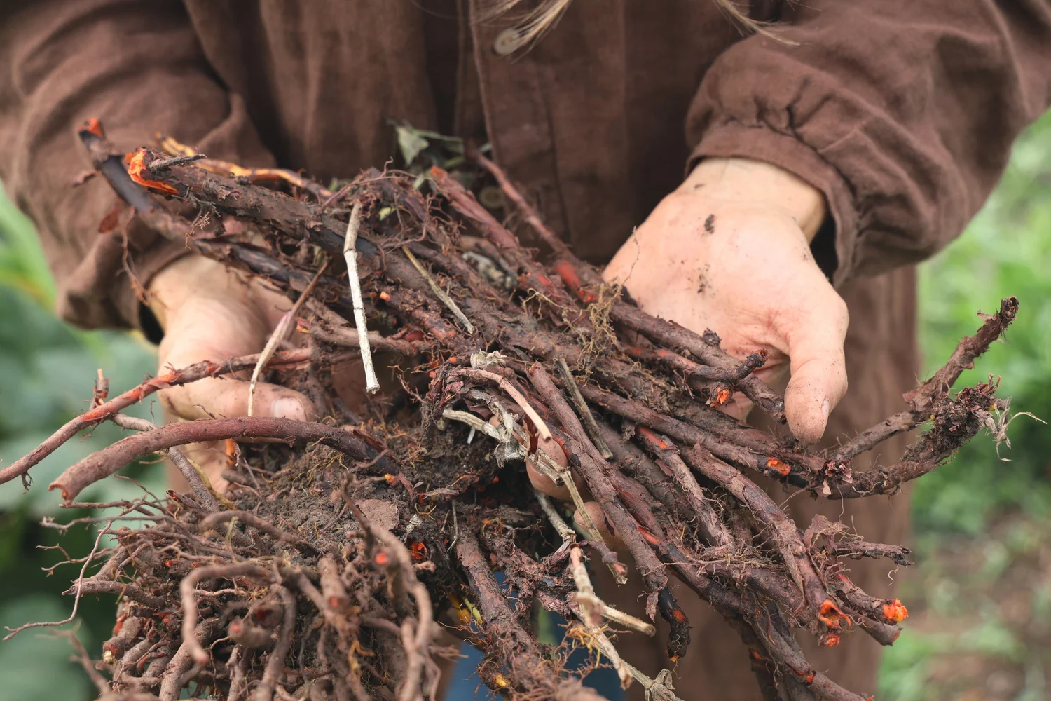
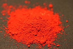
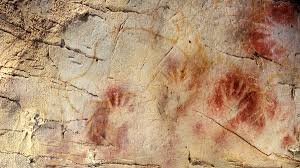
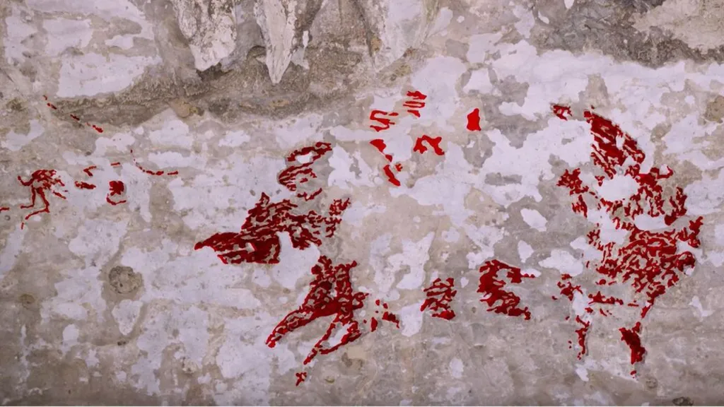
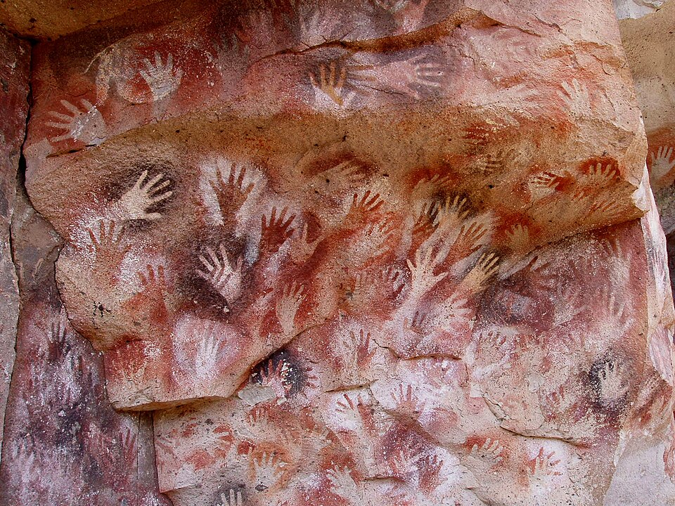
The oldest known human-made images are hand stencils and handprints found in caves. Among the most ancient are those in the El Castillo cave in Spain (~40,000 years old) and the caves of Sulawesi in Indonesia (~39,900 years old). These were created by blowing red ochre pigment through a hollow bone around a hand pressed against the cave wall — not, as sometimes imagined, painted in blood (blood darkens to brown quickly and does not preserve).
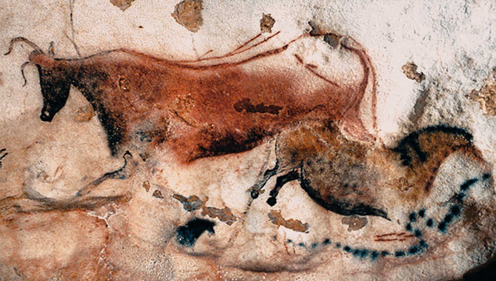
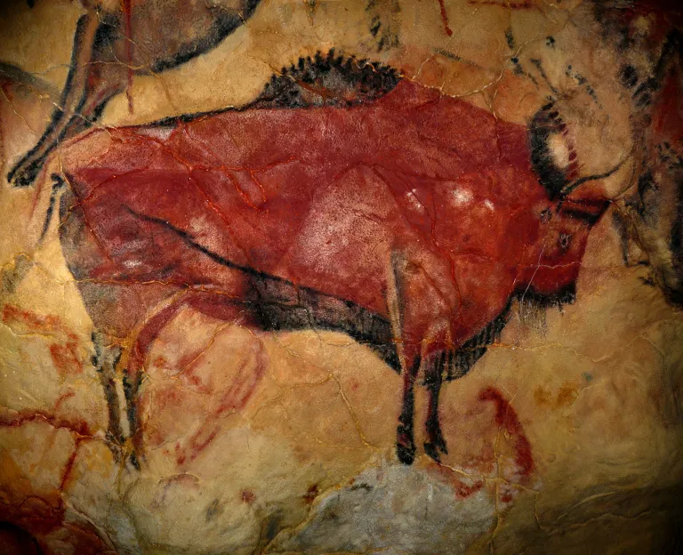
Prehistoric artists had a limited but powerful palette: red ochre, yellow ochre, black from charcoal or manganese dioxide, and white from chalk or kaolin clay. The famous cave paintings in Lascaux (France, ~17,000 years old) and Altamira (Spain, ~15,000 years old) used these pigments to depict animals with remarkable sophistication — shading, movement, and even a sense of three-dimensionality.
Archaeological evidence suggests that ochre — particularly red ochre — held special significance well beyond art. It was used in burials, body decoration, and possibly ritual practices as far back as 100,000 years ago. Red may be the first colour to hold symbolic meaning in human culture.
In the ancient civilizations of Egypt, Mesopotamia, Greece, and Rome, colour was inseparable from power, religion, and status.
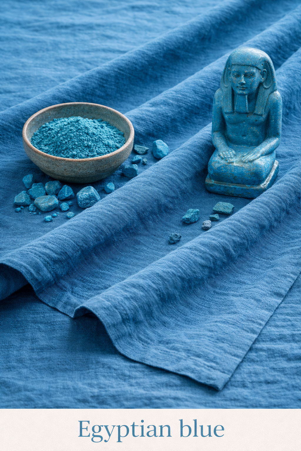
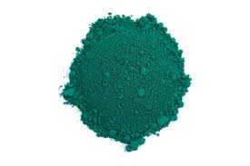
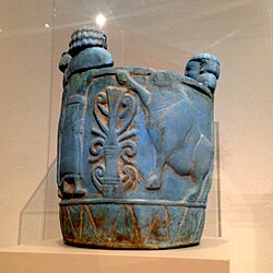
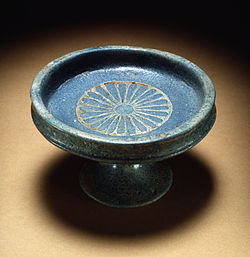
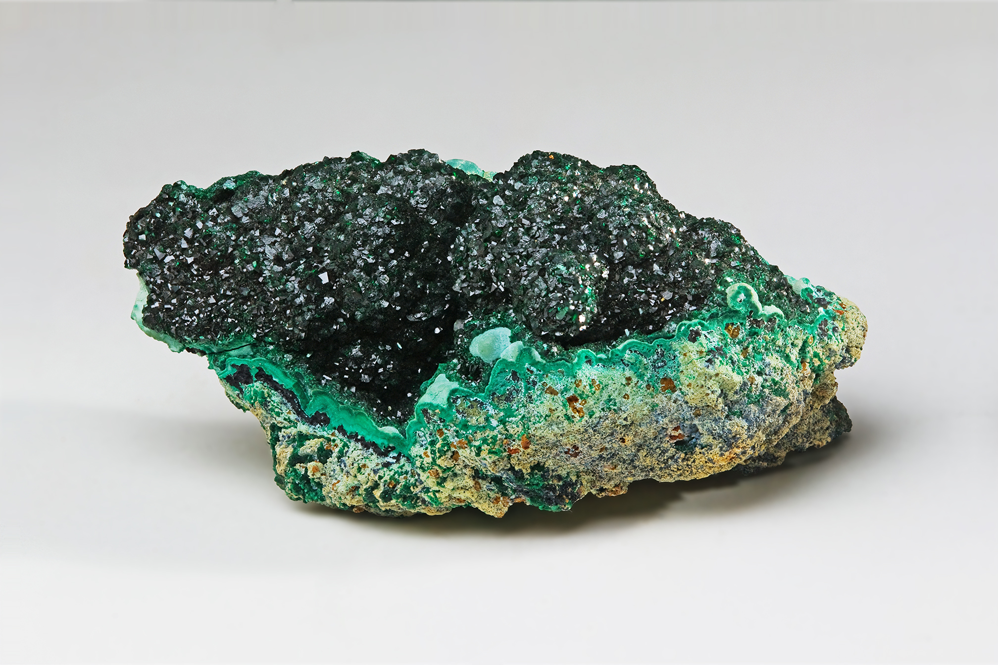
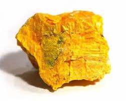
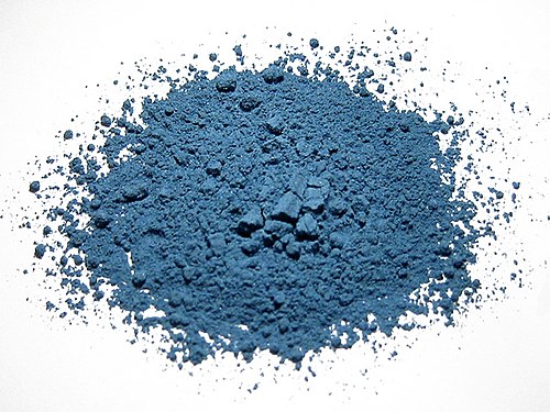
The Egyptians were master pigment-makers. They invented Egyptian blue (calcium copper silicate) around 2200 BCE — one of the first synthetic pigments in history. They also used malachite (green), orpiment (bright yellow, highly toxic arsenic sulfide), and generous amounts of red ochre. Colour in Egyptian art was symbolic: green represented fertility and rebirth; black represented the fertile Nile soil; gold was the flesh of the gods.
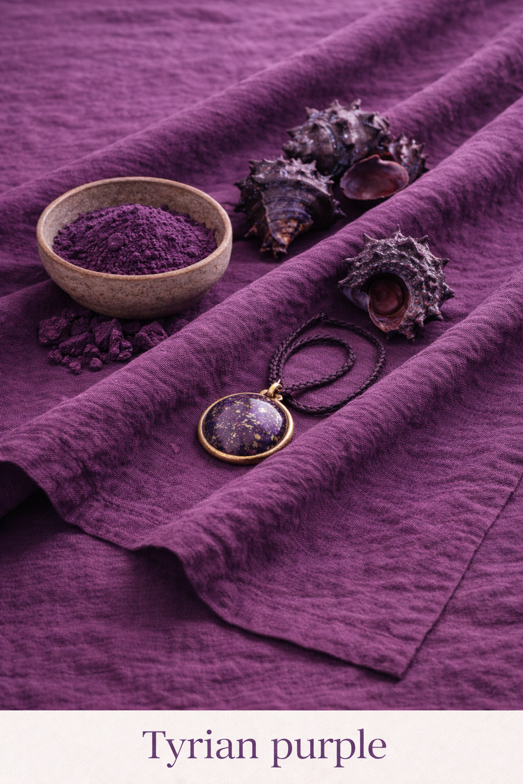
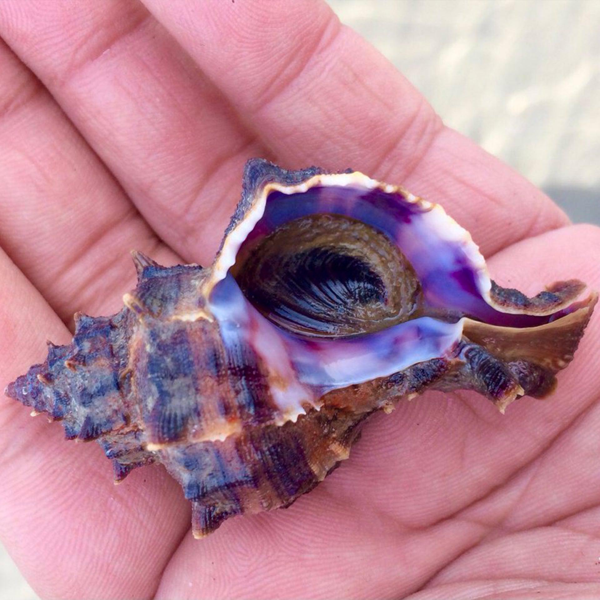
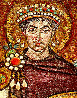
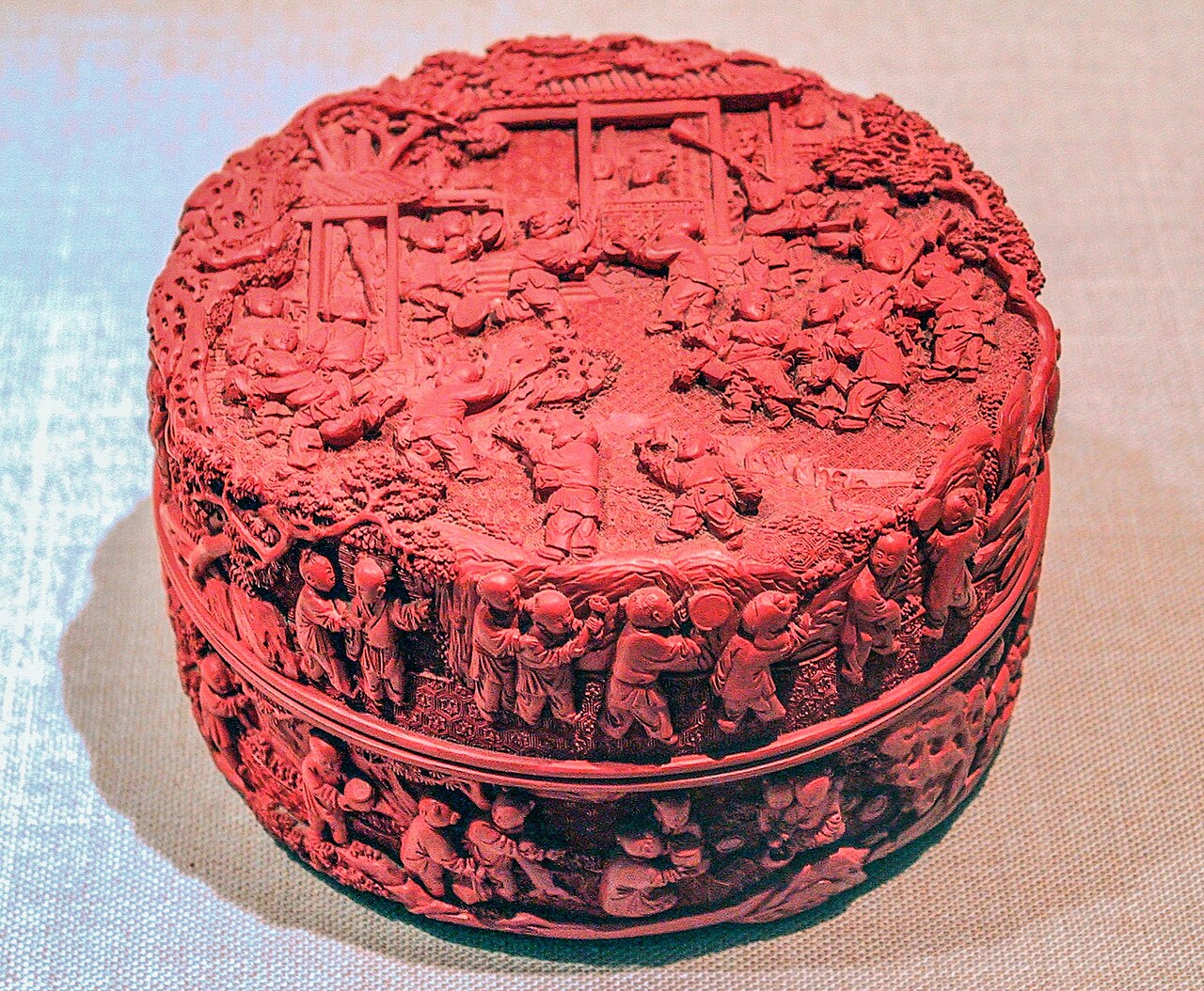
In Rome, the most coveted colour was Tyrian purple — extracted from the mucus glands of predatory Murex sea snails. It took roughly 12,000 snails to produce just 1.5 grams of dye. The resulting colour was extraordinarily expensive and was reserved by law for the emperor and the highest-ranking senators. Wearing purple without authorization was literally a crime. The word “purple” itself traces back to the Latin purpura and the Greek porphyra, both referring to the murex dye.

Popular culture paints the medieval period as drab and colourless — mud, grey stone, and brown wool. The reality was quite different. Medieval people loved colour and used it extensively, though access depended heavily on social class.
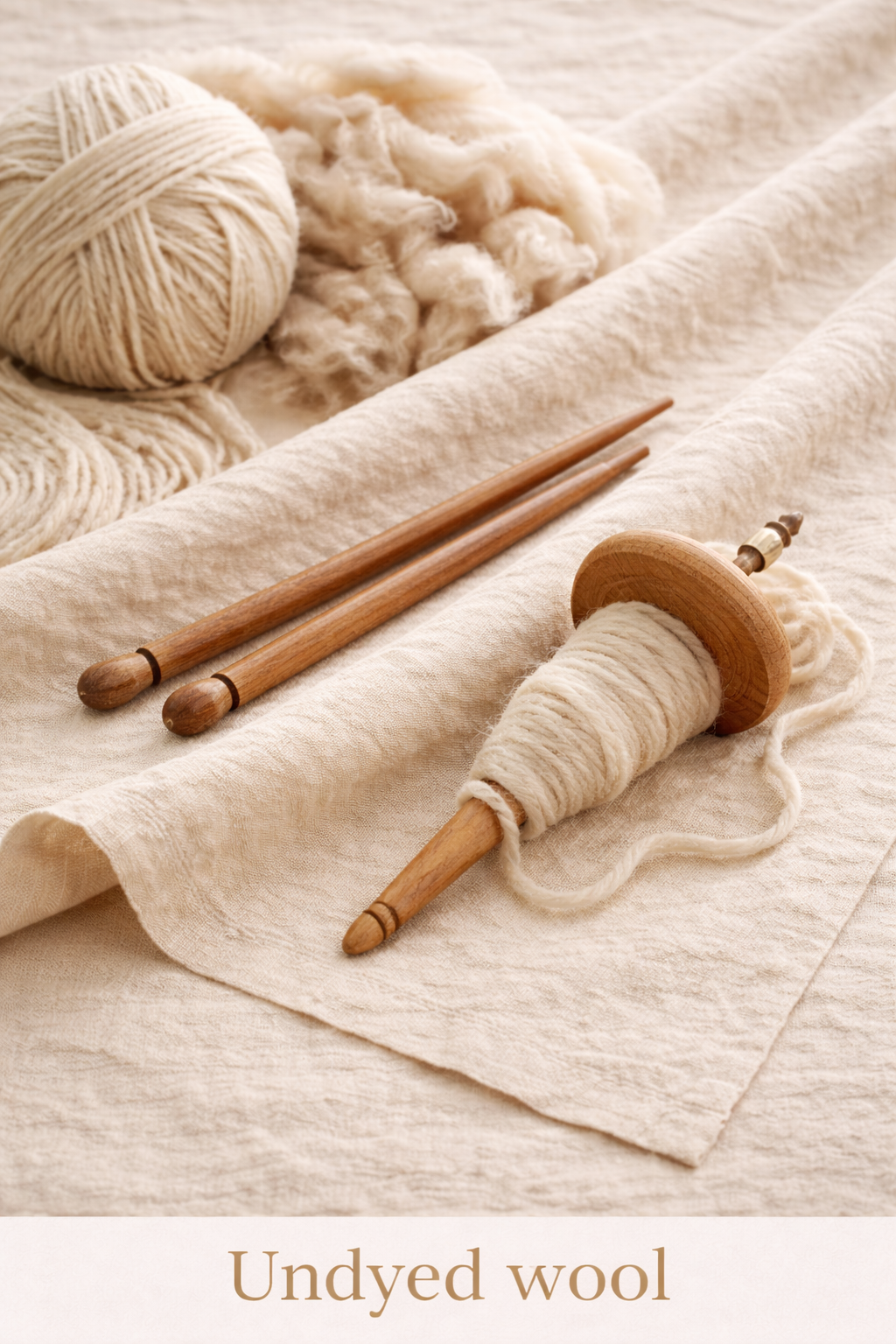
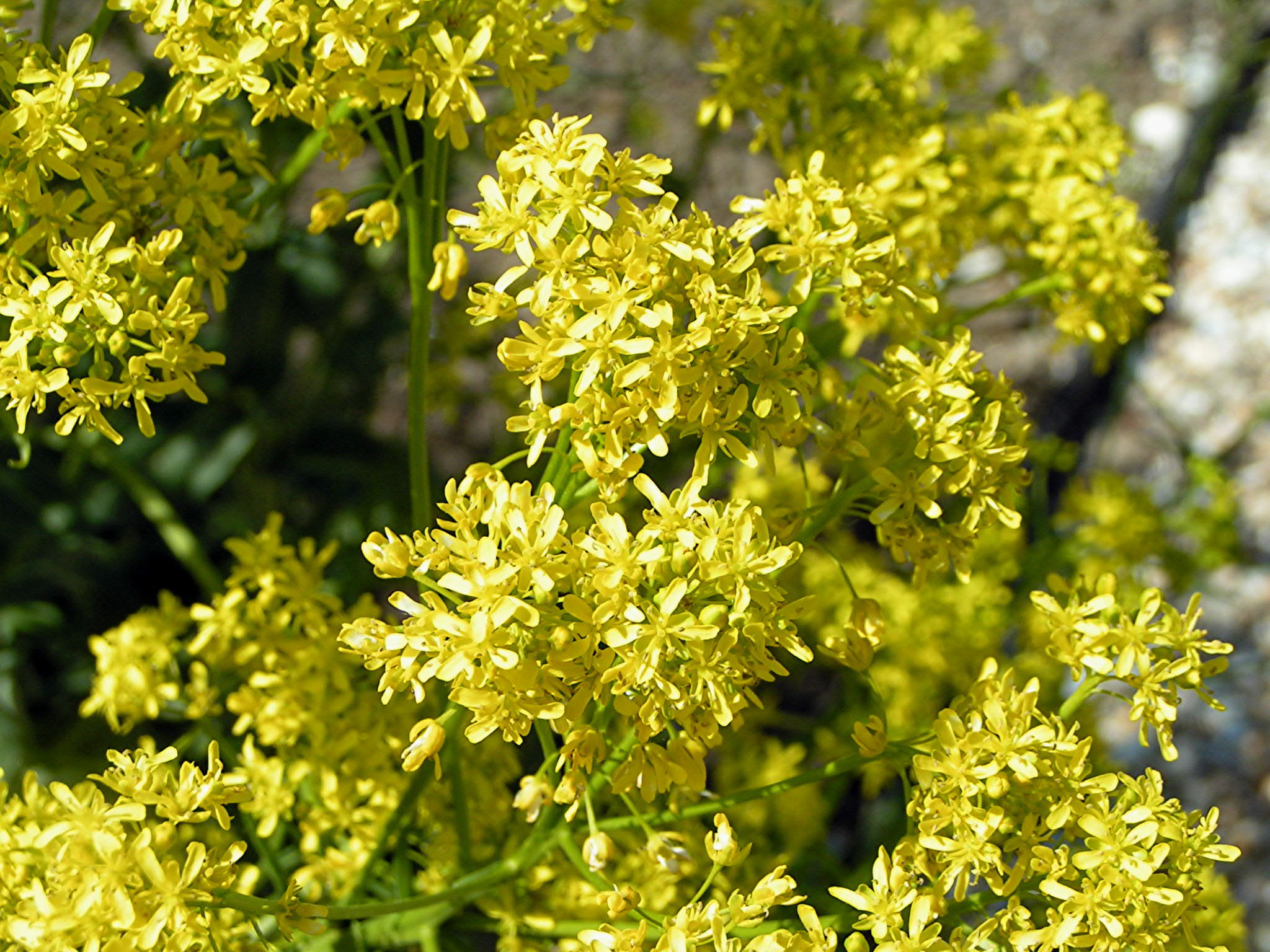
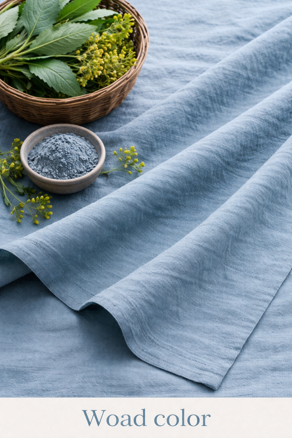
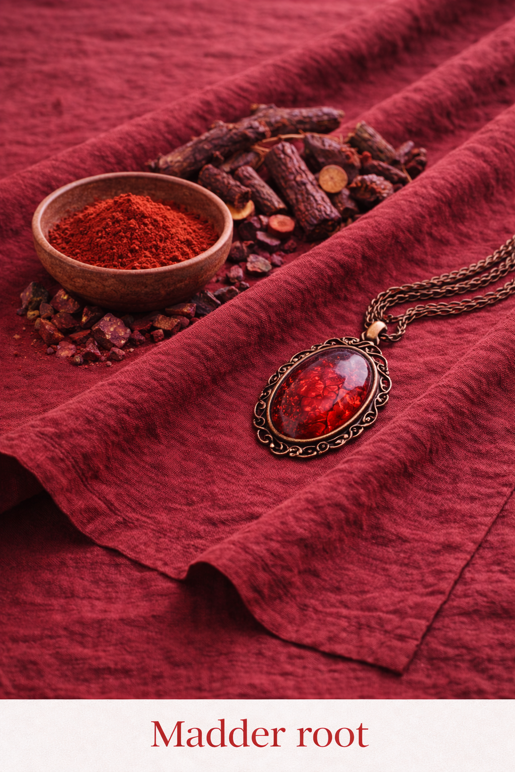
The most common dyes were plant-based: woad for blue (before indigo became available from trade), madder root for red, weld (reseda) for yellow. These could be combined to create greens and oranges. Peasant clothing was typically undyed wool (natural browns and creams) or dyed with cheaper local plants, while nobility wore vivid reds, blues, and — when they could afford it — purple.
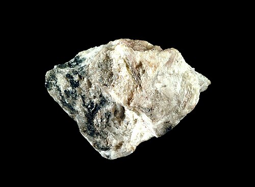
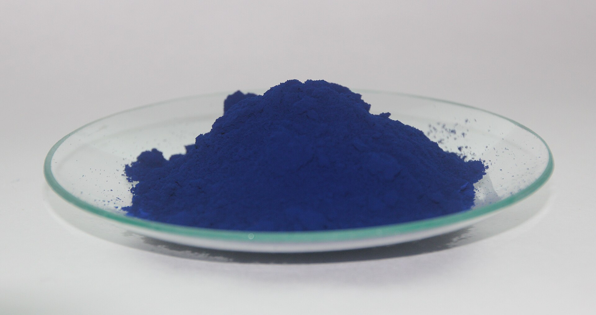
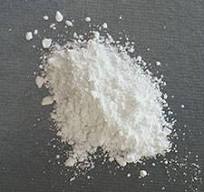
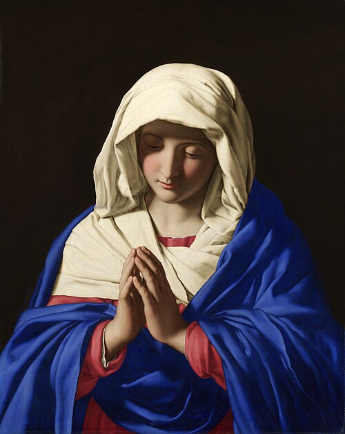
Ultramarine — made by grinding lapis lazuli stone imported from mines in present-day Afghanistan — was the most expensive pigment in medieval Europe. It was more valuable than gold by weight and was reserved for the most sacred subjects in paintings. The Virgin Mary’s robe was traditionally painted in ultramarine blue, a choice that was as much an economic statement as an artistic one — patrons literally paid extra for the privilege of having this pigment used.
Gothic cathedrals, illuminated manuscripts, and heraldic coats of arms show that the medieval world was, in its own way, vibrantly colourful — just unevenly distributed.
The Renaissance brought an explosion of new pigments and a transformation in how painters used colour. Oil painting (popularized by Flemish and Italian masters in the 15th century) allowed for more subtle blending and richer tones than the tempera and fresco techniques that preceded it.
Early Renaissance painters worked with the traditional palette: earth tones (ochres, siennas, umbers), lead white, vermillion (mercury sulfide — a vivid red), azurite (a cheaper blue than ultramarine), and verdigris (copper-based green, unstable and prone to darkening).
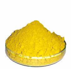
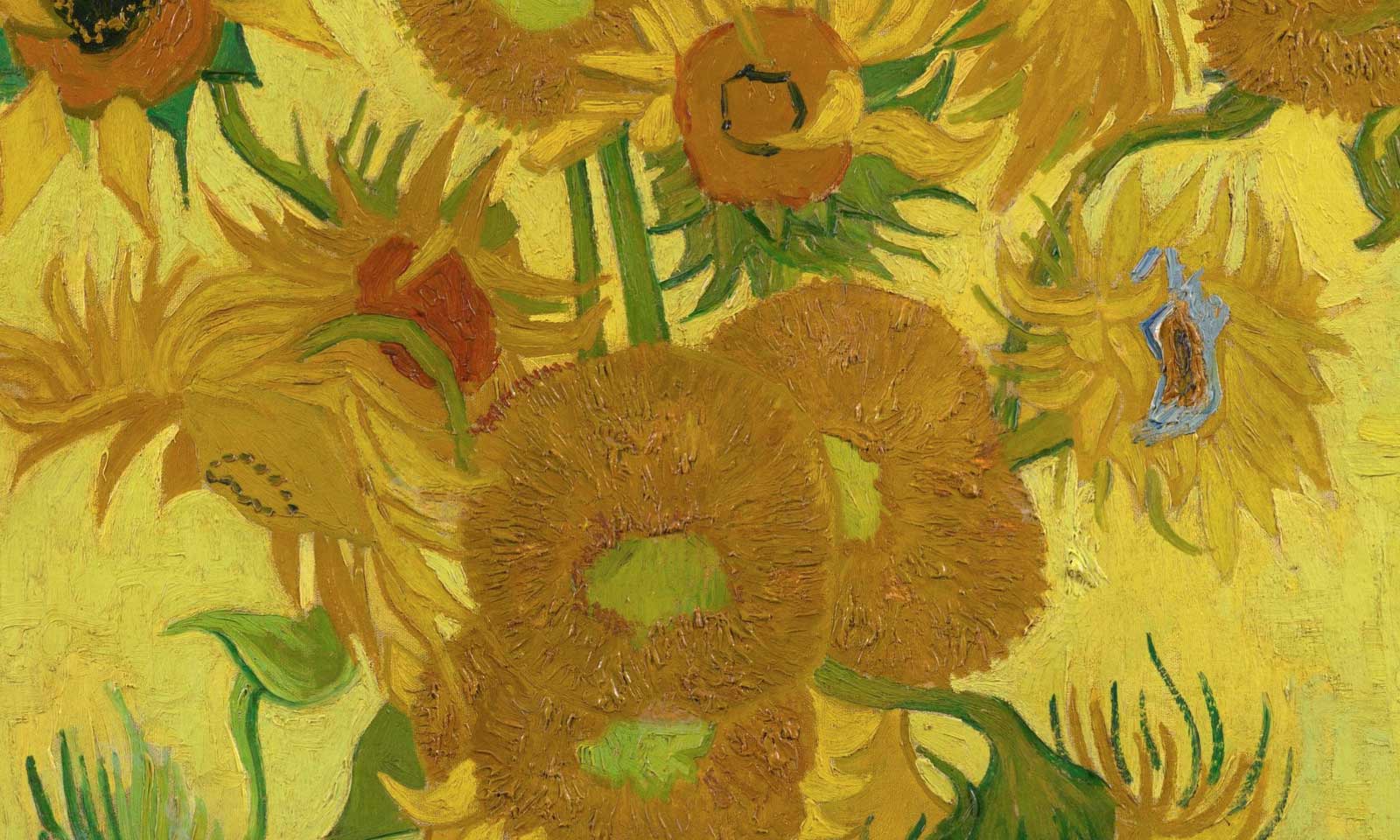
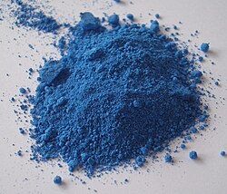
As trade expanded and chemistry advanced, new pigments became available. Prussian blue, discovered accidentally in Berlin around 1706, was the first modern synthetic pigment — affordable and intense, it revolutionized painting and became one of the most widely used blues in history. Chrome yellow (lead chromate, early 1800s) gave painters a brilliant, opaque yellow — it is the yellow of Van Gogh’s sunflowers. Cadmium red and yellow (mid-1800s) offered unprecedented vibrancy and permanence.
The Impressionists, in the late 1800s, were among the first to benefit from a new generation of synthetic pigments available in portable tubes — cobalt blue, viridian green, zinc white. These tube paints freed artists from the studio, enabling them to paint outdoors (en plein air) and capture the fleeting effects of light and colour in nature.
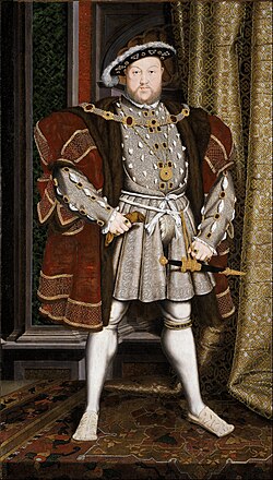
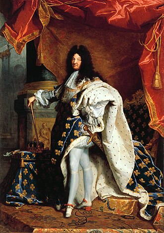
For centuries, elite men dressed as colourfully as women. Henry VIII wore gold, crimson, and jewels; Louis XIV was famous for his red-heeled shoes and lavish silks. Male fashion was a display of wealth, status, and power — the more vivid the colours, the higher the rank.
Then, in the late 18th century, everything changed. The French Revolution and the rise of Enlightenment ideals redefined what a respectable man should look like. Ornament, colour, and display became associated with aristocratic decadence. The new bourgeois man signalled seriousness, rationality, and democratic equality through his clothing — by renouncing all of it. The psychologist J.C. Flügel later coined the term “The Great Male Renunciation” to describe this shift.
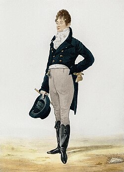
The embodiment of the new ideal was Beau Brummell — the man who replaced aristocratic flamboyance with immaculate simplicity. Clean lines, perfect fit, no ornament. His palette: white, black, navy blue, and buff. A man’s worth now lay in his mind, not his appearance.
The entire masculine palette collapsed into a narrow band of desaturated, dark tones — each with its own origin story:
Clergy, mourning, the legal profession. The most "serious" colour since the Reformation — dyed with iron gall and tannins.
Wool naturally produced dark grey without expensive dyeing — the default of the rising middle class.
Undyed wool. Modesty made visible — the opposite of aristocratic display.
French for "mole." A grey-brown bridge between the grey and brown families — overcoats, waistcoats, trousers. Neutral enough to be invisible.
Leather, walnut dye, undyed wool. The colour of rural gentry and country life.
Hindi for "dust-coloured." Adopted by the British Indian Army in the 1840s, then absorbed into civilian wear. Note: in French, kaki typically refers to olive-green shades rather than sandy-beige — a linguistic colour shift similar to the Russian blue distinction.
Not a dominant colour but an essential supporting element — shirts, collars, cuffs. Provided contrast against the dark palette. Ranged from pure white to muted ivory.
Named after the Royal Navy (1748). Indigo was cheap and colourfast. Spread to police, business, schools — the colour of institutional authority.
Military and hunting origins. Acceptable because it read as functional, not decorative.
This convention persists to this day. Though it has loosened in recent decades, the Renunciation palette is essentially the core colour palette of modern smart casual and business dress — for both men and women. Black, charcoal, navy, white, taupe, and brown remain the “safe” foundation that every wardrobe guide recommends as essentials. Accent colours are added on top, but the base layer of any professional wardrobe is still, two centuries later, drawn from this same narrow slice of colour space. The Great Male Renunciation didn’t just change men’s fashion — it defined the default palette of modern clothing.
In the modern era, colour has become intellectual property. Brands create, trademark, and fiercely protect specific shades as part of their identity:
Pantone 1837 (named after the year the company was founded). Trademarked since 1998. The robin-egg blue of the iconic Tiffany box.
Developed and registered by French artist Yves Klein in 1960. A unique formula of pure ultramarine pigment suspended in synthetic resin, achieving an intensity of blue that seems to vibrate.
The red lacquered sole of Christian Louboutin shoes. Trademarked specifically for footwear soles, upheld by courts worldwide.
Pantone 2685C. In use since 1914 on chocolate packaging. Cadbury fought extended legal battles over trademark protection.
Created with Pantone for the Valentino Fall 2022 "Pink PP" collection. A vivid, saturated fuchsia-pink that dominated the runway and pop culture.
Born of necessity during WWII when a cardboard shortage left orange as the only available box colour. It became the brand's signature by happy accident.
Colour trademarks only hold when tightly bound to a specific product category. You cannot own “blue” — but you can own a particular blue for jewellery boxes. More examples from across industries show the same pattern:
Known as "Pullman Brown." Registered for logistics and delivery services. One of the most recognised single-colour brand identities in the world.
Protected specifically for self-adhesive notes (Post-it). The same yellow on a different product would not be covered.
RAL 4010 / Pantone Rhodamine Red U. Aggressively defended in telecommunications — T-Mobile has sued companies in unrelated industries for using similar magenta.
A two-colour combination registered for agricultural machinery. Neither green nor yellow alone is protected — only the pairing.
Pantone 219C. Used by Mattel as a core brand element with partial trademark protection in toys and entertainment.
Pantone 2685C. Recognised as distinctive for chocolate in the EU — a stronger legal position than Cadbury achieved for the same shade in the UK.
The underlying legal principle: a colour cannot be monopolised as an abstract entity, but it can be protected within a narrowly defined product category — provided the brand can demonstrate that consumers associate that specific shade with that specific source. Colour ownership is never absolute; it is always contextual.


